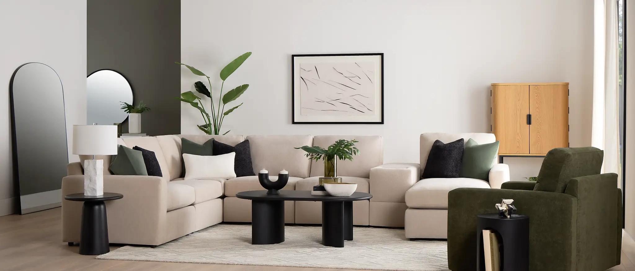
Spring Color Story: How to Refresh Your Home in 2026
Spring is the perfect season to reset your space, and 2026 brings a fresh, calming approach to home color trends. The Spring Color Story this year is all about soft optimism—think nature-inspired hues, warm pastels, and effortless combinations that instantly brighten your home. Whether you’re planning a full refresh or subtle updates, the right colors can transform your interiors, boost mood, and make your space feel lighter, fresher, and more intentional for the season ahead.
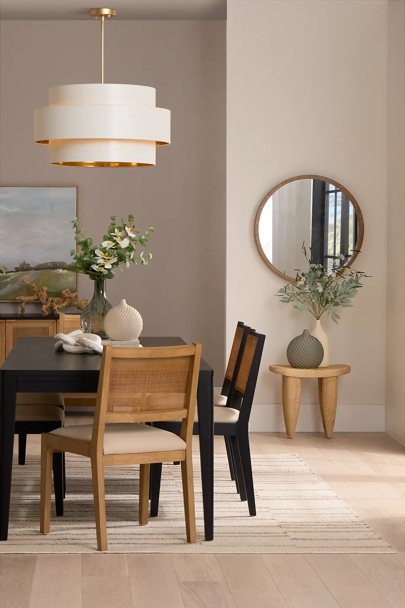
Sage Green & Botanical Neutrals: The Foundation of Spring Home Design in 2026
Nature continues to be the strongest design influence in 2026, and sage green leads the spring color story with its calming, restorative appeal. Paired with eucalyptus, olive, moss, and soft herbal neutrals, this palette creates interiors that feel grounded, timeless, and effortlessly fresh. These hues work especially well in living rooms and bedrooms, where comfort, balance, and relaxation are essential.
Sage green acts as a modern neutral—subtle enough to soothe the eye, yet rich enough to add depth and personality. In spring, it reflects renewal and growth, making it ideal for homeowners looking to refresh their space without committing to bold or overpowering colors.
The Benefits of Sage Green and Botanical Neutrals for Balanced, Year-Round Living:
-
Supports wellness-focused and biophilic design trends
-
Pairs beautifully with natural materials like wood, stone, and linen
-
Transitions seamlessly across seasons
Incorporating Sage Green and Botanical Neutrals into Modern Spring Interiors:
-
Accent walls: Paint one wall in sage green to create a serene focal point without overwhelming the room
-
Soft furnishings: Introduce cushions, throws, and curtains in botanical tones for an easy, budget-friendly update
-
Decor accents: Use indoor planters, ceramic vases, and textured pottery to subtly layer in the color
-
Material pairings: Combine with light oak, rattan, jute rugs, or warm whites for a fresh spring balance
For a modern spring look, keep the base palette neutral and let sage green and botanical tones quietly elevate the space—bringing the outdoors in while maintaining a refined, contemporary feel.
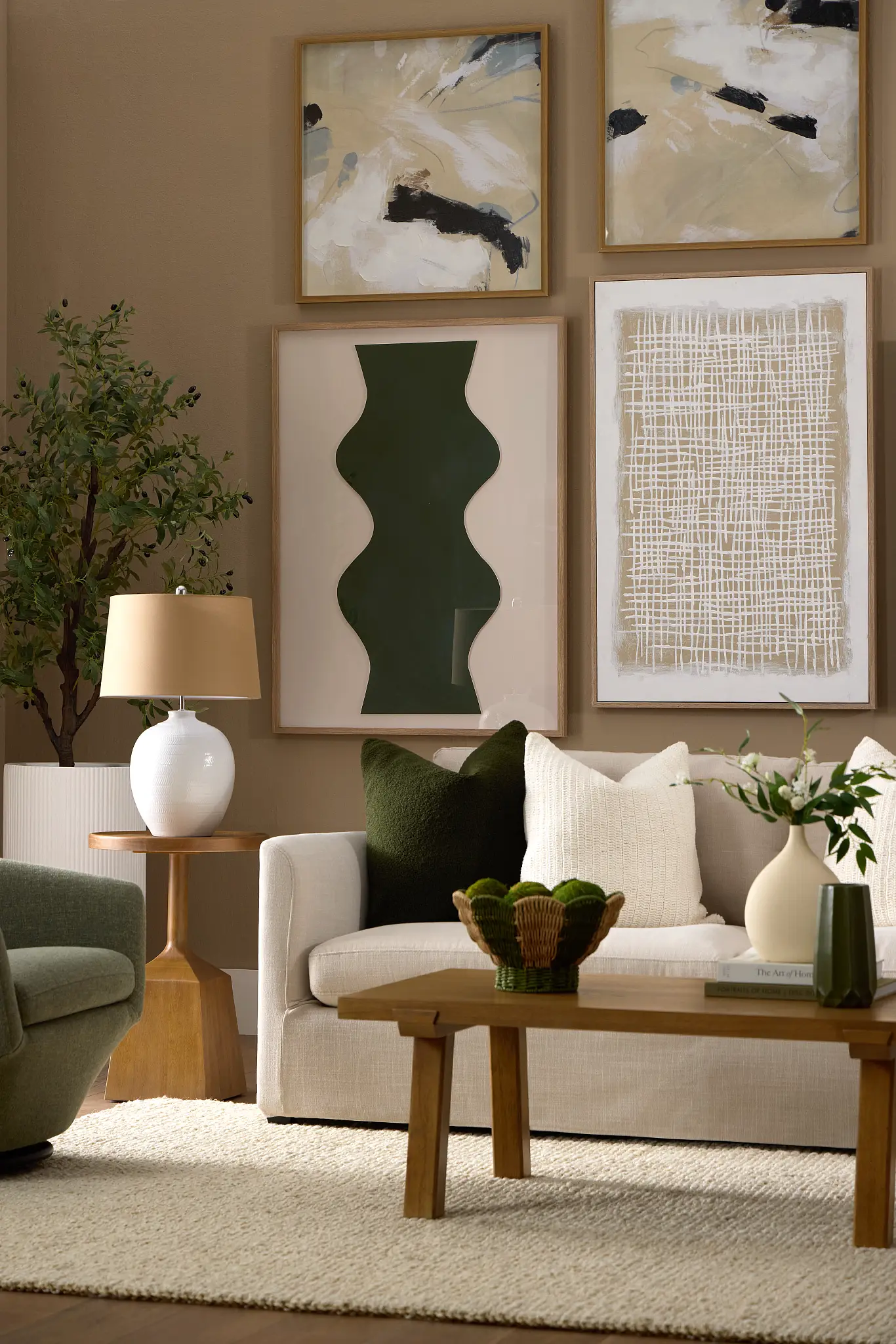
Butter Yellow & Soft Citrus: Bright, Balanced Spring Color Trends for 2026 Homes
In spring 2026, bold, high-energy yellows step aside for butter yellow and soft citrus tones that feel warm, inviting, and beautifully balanced. These muted shades capture sunlight without overpowering a room, making them perfect for adding cheer and brightness in a refined, modern way. Think creamy yellow, pale lemon, and soft tangerine—colors that lift the mood while remaining easy to live with.
Butter yellow works especially well as an accent color, bringing a sense of freshness and optimism that aligns perfectly with spring’s natural energy. When layered thoughtfully, it adds warmth to neutral spaces and pairs effortlessly with whites, soft grays, light wood, and botanical greens.
Why Butter Yellow and Soft Citrus Are Spring 2026’s Most Uplifting Color Trends:
-
Reflects the shift toward soft optimism and joyful minimalism
-
Brightens interiors without visual fatigue
-
Complements both modern and classic home styles
Best Rooms for Butter Yellow and Soft Citrus Accents This Spring:
-
Kitchens and breakfast nooks: Adds a sunny, welcoming feel that enhances morning light
-
Entryways: Creates an inviting first impression as soon as you step inside
-
Decorative accessories: Vases, table linens, wall art, lampshades, and ceramics
Soft Citrus Styling That Feels Fresh, Calm, and Spring-Ready:
Use butter yellow in small, intentional doses—such as bar stools, dishware, or throw pillows—and balance it with natural textures like linen, stone, or light wood to keep the look elegant and spring-ready rather than bold or overwhelming.
This gentle citrus palette is ideal for homeowners who want their space to feel bright, positive, and refreshed, without sacrificing calm or sophistication.
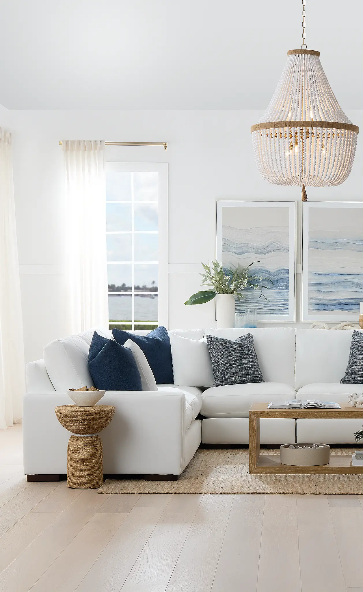
Sky Blue & Misty Aqua: Airy, Wellness-Driven Spring Color Trends for 2026 Interiors
Light blues take center stage in the Spring Color Story for 2026, channeling the feeling of open skies, gentle breezes, and fresh spring air. Sky blue and misty aqua tones instantly make interiors feel lighter, more spacious, and effortlessly calm—ideal for creating a serene escape from everyday life.
These shades work beautifully in spring because they reflect natural light and promote a sense of clarity and relaxation. Softer than traditional blues, misty aqua and sky blue feel modern and soothing rather than cool or formal, making them versatile across both contemporary and transitional interiors.
The Benefits of Sky Blue and Misty Aqua for Balanced, Modern Living Spaces:
-
Enhances light and openness in smaller or darker rooms
-
Supports calm, wellness-inspired living spaces
-
Feels timeless while still aligning with modern trends
Best Rooms for Sky Blue and Misty Aqua in a Fresh Spring Palette:
-
Living rooms and open-plan spaces
-
Bedrooms for a tranquil, sleep-friendly atmosphere
-
Bathrooms and home offices for a fresh, clean look
Styling Sky Blue and Misty Aqua with White, Light Wood, and Airy Textures:
Pair sky blue and misty aqua with crisp white walls, linen or cotton textiles, and light oak or ash wood furniture to achieve a relaxed coastal-modern aesthetic. Finish the look with subtle metallic accents or clear glass decor to keep the space feeling airy and refined.
This color combination is perfect for homeowners who want a spring refresh that feels fresh, breathable, and timeless, without leaning too nautical or overly themed.
Earthy Pastels: Refined, Nature-Inspired Spring Color Trends for 2026 Homes
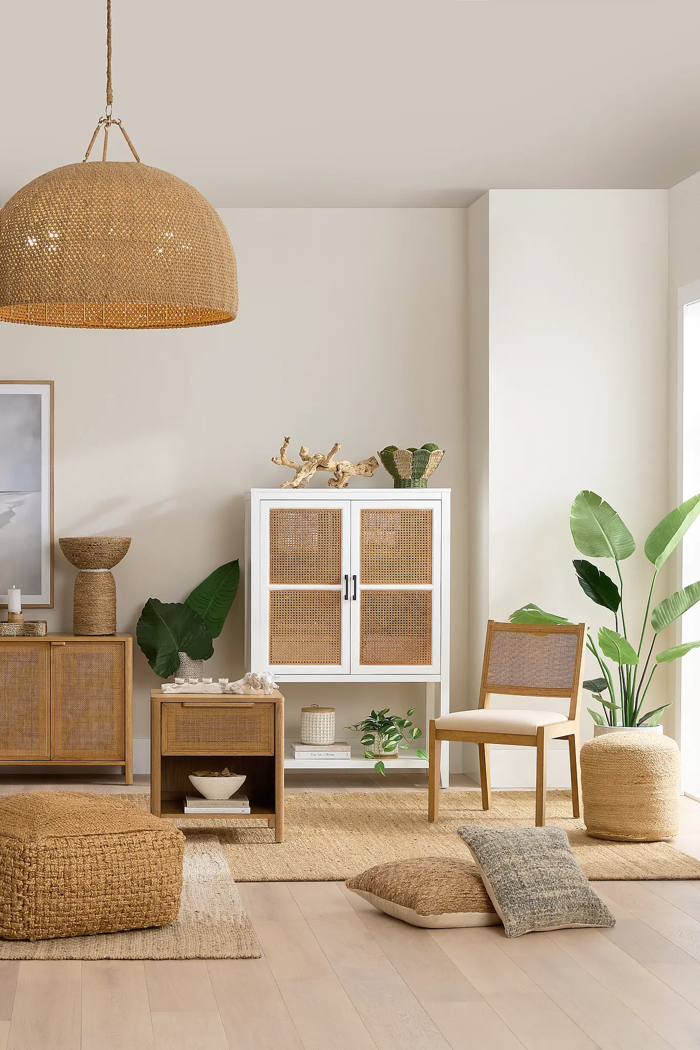
Pastels in 2026 take on a more grounded, sophisticated identity, moving away from sugary or overly playful tones. Earthy pastels—such as clay pink, warm sand, soft terracotta, and muted blush—offer warmth and depth while still feeling light enough for spring. These hues strike the perfect balance between softness and maturity, making them ideal for modern, lived-in homes.
Inspired by natural landscapes and raw materials, earthy pastels add subtle color without dominating a space. They create a cozy, welcoming atmosphere and work beautifully as transitional shades that carry your home from spring into summer and beyond.
Why Earthy Pastel Colors Are Perfect for a Modern Home Refresh:
-
Feels refined, calming, and emotionally warm
-
Pairs seamlessly with neutral and organic palettes
-
Adds color without visual overwhelm
Where to Use Earthy Pastels for Cozy, Warm, and Inviting Spring Spaces:
-
Bedrooms and reading corners for a cozy, relaxed mood
-
Living rooms layered with neutrals and textures
-
Dining spaces to create warmth and intimacy
How to style earthy pastels:
-
Use clay or blush tones in upholstery, cushions, or area rugs
-
Introduce sand and soft terracotta through ceramics, lamps, or wall art
-
Balance with natural textures like linen, wool, travertine, or light wood
Earthy pastels are perfect for those who want their spring refresh to feel elevated, timeless, and deeply connected to nature, offering color that soothes rather than shouts.
Room-by-Room Spring Refresh Guide: Easy Color Updates for Every Space in 2026
Refreshing your home for spring doesn’t require a full makeover—just a few thoughtful updates in the right places. This Room-by-Room Spring Refresh Guide breaks down simple, seasonal changes you can make in each space to bring in lighter textures, fresh colors, and a renewed sense of calm. From the living room to the bathroom, these ideas will help your home feel brighter, more inviting, and perfectly in tune with spring 2026.
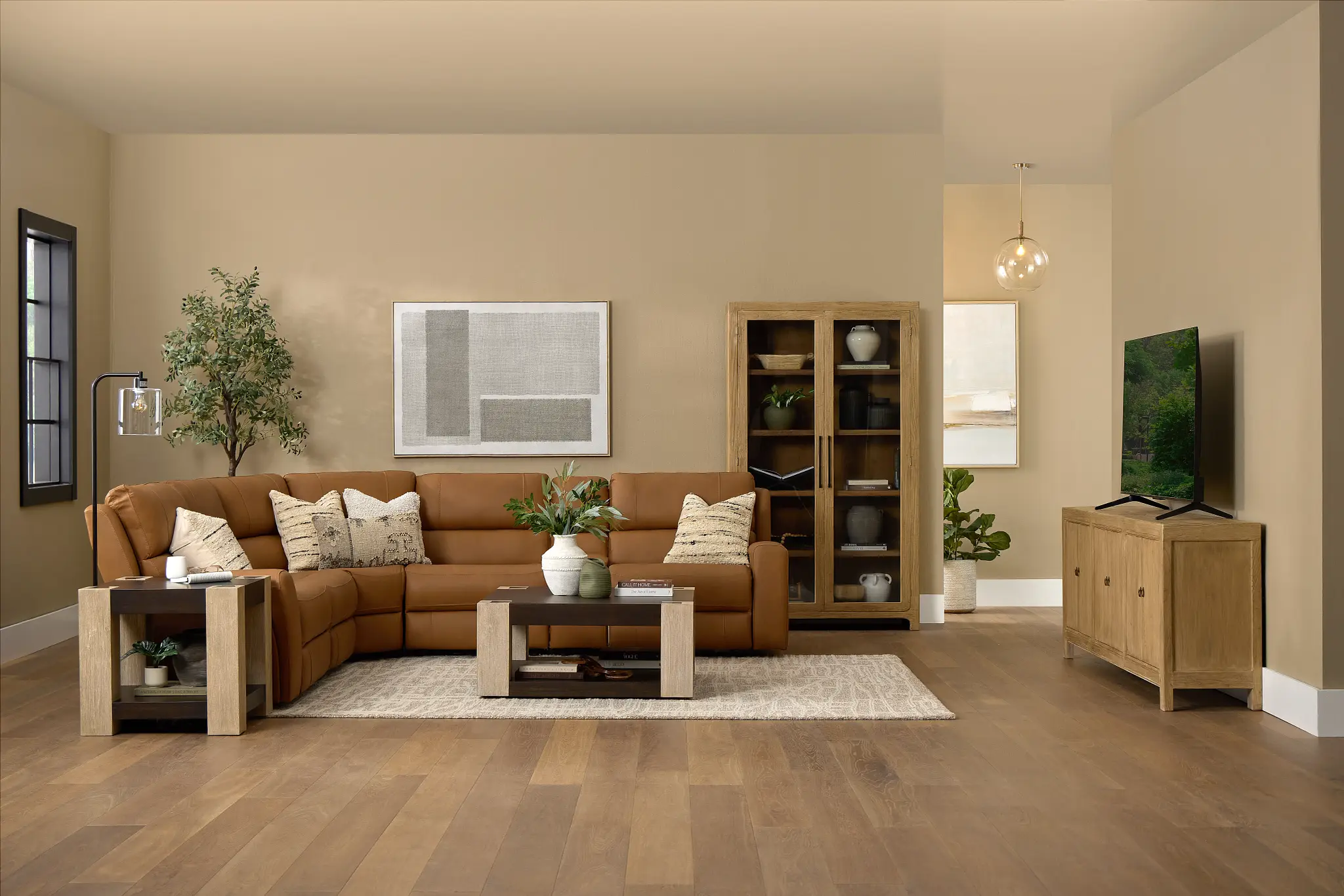
Living Room: Light Textiles & Seasonal Accent Furniture
The living room is often the heart of the home, making it the perfect place to start your spring refresh. As the seasons change, swap out heavy, dark winter textiles for lightweight cotton or breathable linen to instantly brighten the space.
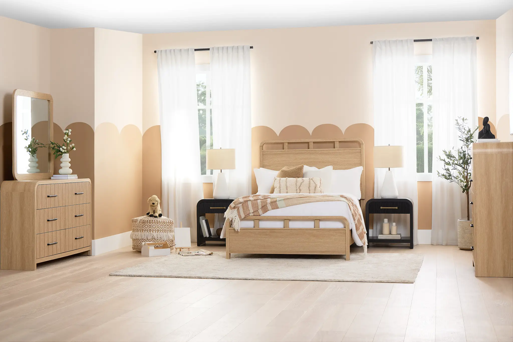
Bedroom: Calming Spring Colors for Restful Spaces
Spring 2026 bedroom design is centered around rest, softness, and visual calm. Opt for pastel bedding in shades like sage green, blush, or misty blue to create a soothing foundation. Complement this with botanical prints or watercolor-style artwork.
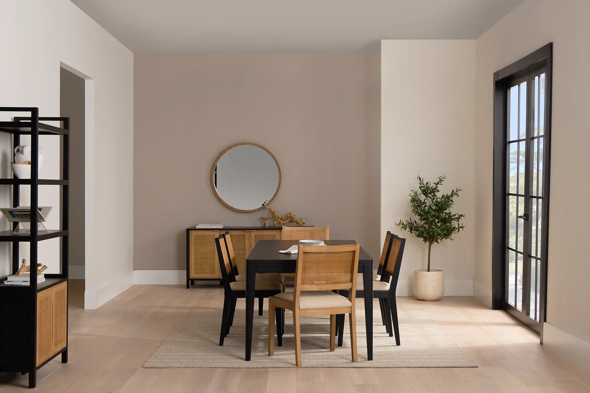
Dining Room: Fresh Color Accents for Everyday Gathering
The dining room comes alive in spring, and small updates can make a big impact. Refresh the space with upholstered dining chairs in soft seasonal tones, pastel tableware, or textured ceramics that beautifully reflect the Spring 2026 color palette.
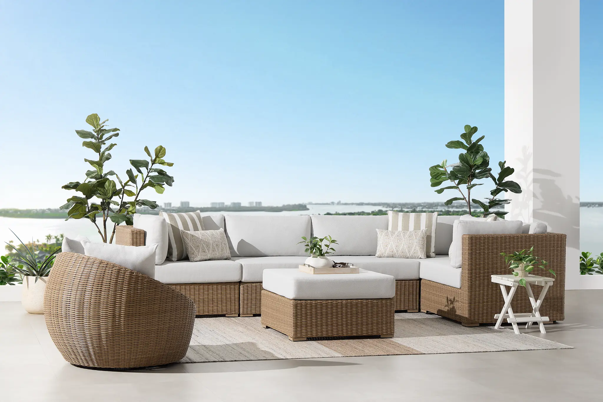
Outdoor Spaces: Spring-Ready Comfort and Color
A spring outdoor refresh should feel light, inviting, and effortlessly relaxing. Swap out heavy or faded cushions for fresh textiles in soft blue, sand, sage, or warm neutral tones to create a calm, seasonal atmosphere. Keep accessories simple and intentional.
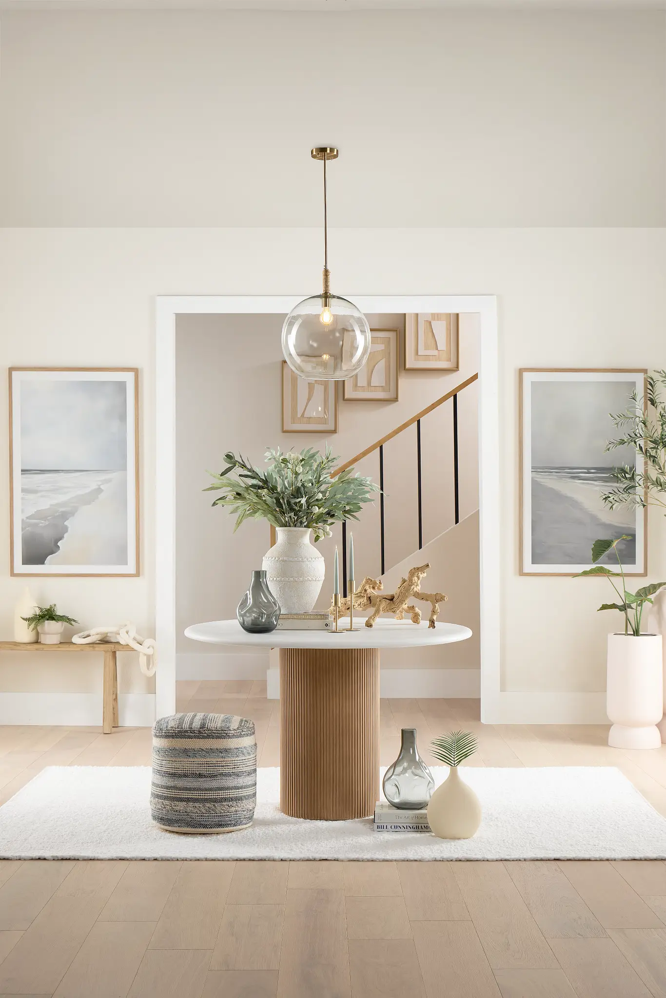
How to Create a Spring Color Story for Your Home in 2026
Creating a spring color story is about balance, intention, and harmony—not filling your home with too many colors at once. By following a simple, step-by-step approach, you can design a space that feels refreshed, cohesive, and perfectly suited for spring 2026.
Step 1: Build a Timeless Neutral Foundation with White, Beige, or Warm Gray
Start with a timeless foundation. Shades like white, beige, or warm gray provide a flexible backdrop that reflects light and allows seasonal colors to shine. A neutral base ensures your space feels open and makes it easy to update accents as trends evolve without needing a full redesign.
Step 2: Choose One or Two Spring Accent Colors for a Balanced, Cohesive Look
Select one or two trending spring hues—such as sage green, butter yellow, or misty blue—and use them intentionally. Limiting your accent colors creates visual balance and prevents the space from feeling busy or overwhelming. These colors should complement your base neutral and appear consistently throughout the room.
Step 3: Use Natural Textures to Add Warmth, Depth, and Dimension
Texture is what brings a color story to life. Incorporate natural materials like linen, wood, ceramic, rattan, or stone to add warmth and depth. Textures help colors feel richer and more dimensional, making the space feel curated rather than flat.
Step 4: Remove excess decor to let colors and materials shine
Resist the urge to overdecorate. A successful spring color story leaves room to breathe. Edit out unnecessary items, focus on meaningful decor, and allow each color and material to stand out. The result is a calm, modern space that feels refreshed, thoughtful, and effortlessly seasonal.
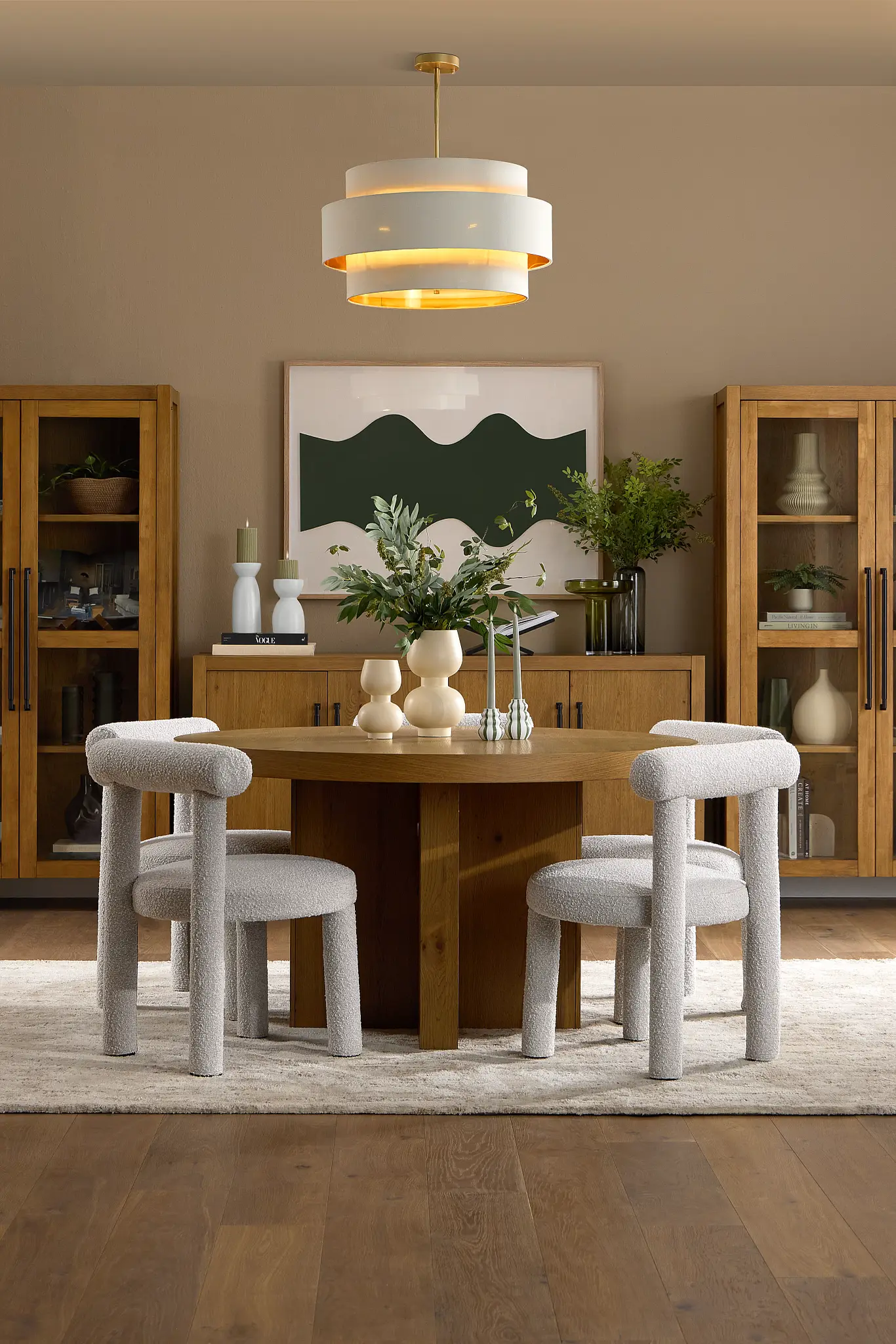
Budget-Friendly Spring Decorating Tips for a Fresh 2026 Home Update
Refreshing your home for spring doesn’t have to mean a big investment. With a few smart, low-cost updates, you can achieve a seasonal transformation that feels just as impactful as a full redesign.
-
Change Cushion Covers Instead of Furniture
One of the easiest and most affordable ways to update your space is by swapping out cushion covers. Replace dark, heavy fabrics with light cotton or linen in spring-inspired colors like sage, blush, or soft yellow. This instantly refreshes the room without the expense of new furniture.
-
DIY Wall Art Using Spring Color Palettes
Create your own artwork using soft spring color palettes. Simple abstract designs, botanical sketches, or painted color blocks can add personality and trend-forward style to your walls. DIY art not only saves money but also allows you to customize colors to perfectly match your spring color story.
-
Thrift Pastel Vases or Ceramics
Secondhand stores and flea markets are great places to find pastel vases, ceramic bowls, or decorative objects. These small accents are perfect for layering in spring color and texture, and they can be styled on shelves, coffee tables, or dining spaces for a curated look.
-
Rearrange Furniture to Invite Natural Light
Sometimes the best refresh is completely free. Rearranging furniture to improve flow or maximize natural light can make a space feel brighter and more open. Move seating closer to windows, remove visual obstructions, and let sunlight become part of your spring décor.
With these budget-friendly tips, you can embrace the Spring Color Story for 2026 in a way that feels fresh, stylish, and accessible—proving that great design doesn’t have to be expensive.
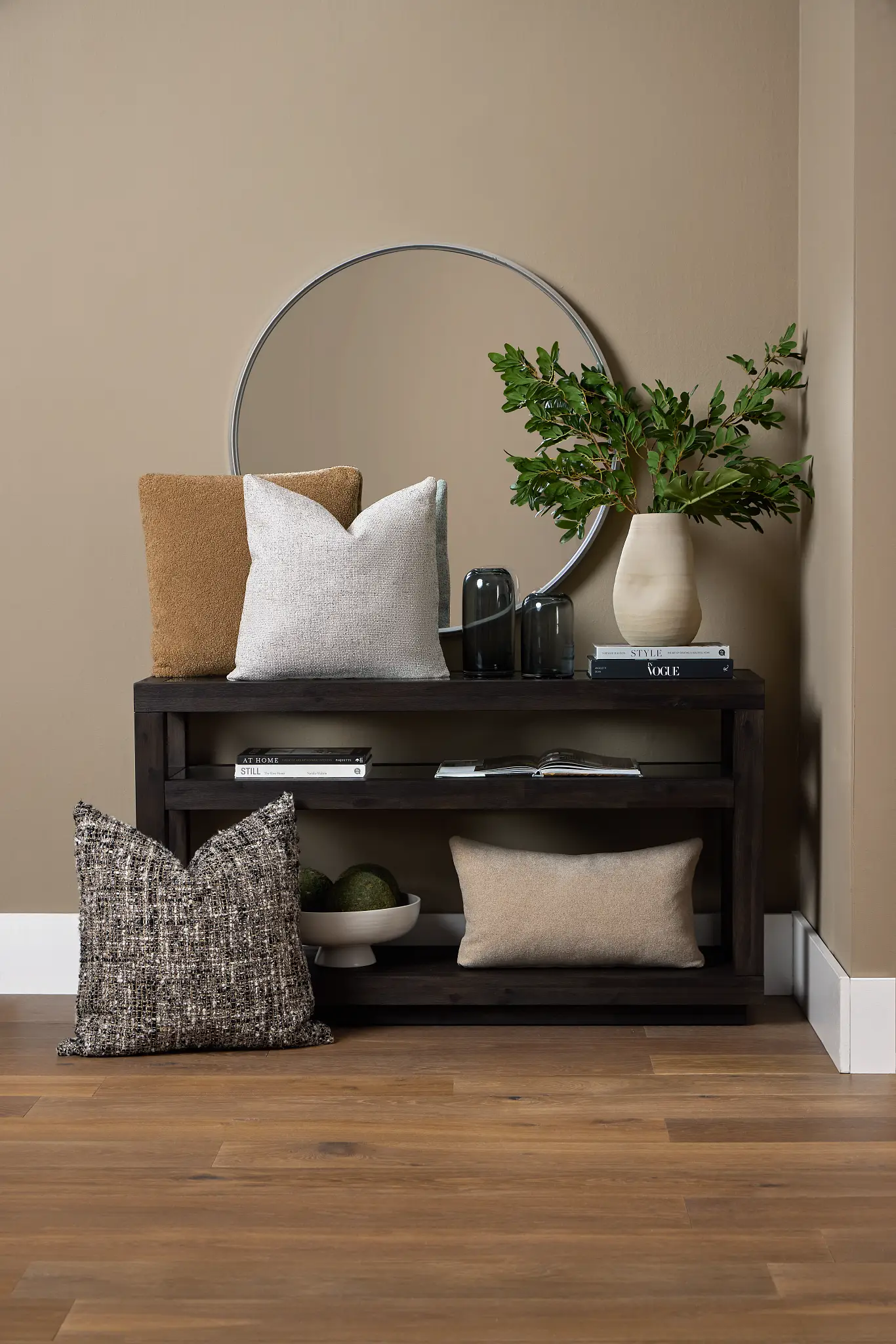
Why Spring Color Stories Matter in 2026: Designing for Wellness, Nature & Modern Living
In a post-digital, hybrid-lifestyle world, our homes have become more than just places to live—they are spaces for work, rest, creativity, and emotional reset. As a result, home design in 2026 is deeply connected to mental clarity, sustainability, and personal identity. Color plays a powerful role in shaping how we feel within our spaces, making a thoughtful spring color story more important than ever.
Spring 2026 color trends place a strong emphasis on emotional comfort, favoring soft, calming hues that reduce visual stress and create a sense of balance. These colors help homes feel supportive and nurturing, especially as people seek refuge from fast-paced digital lives.
There is also a renewed connection to nature, reflected in botanical greens, earthy pastels, and sky-inspired blues. These shades bring the outdoors in, reinforcing wellness-focused and biophilic design principles that continue to influence modern interiors.
Finally, today’s homeowners value long-term versatility over short-lived trends. The spring color stories of 2026 are designed to evolve with the seasons, blending easily with existing décor and remaining relevant well beyond spring.
Refreshing your home with the right color story isn’t just an aesthetic update—it’s a transformational shift that supports well-being, reflects your lifestyle, and creates a space that truly feels like home.
Final Thoughts: Embracing the Spring Color Story of 2026 for a Calm, Modern Home
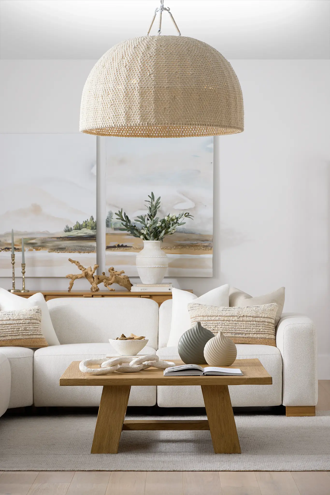
The Spring Color Story for 2026 is soft, grounding, and refreshingly modern—rooted in nature, shaped by comfort, and designed for real life. This season’s palette moves beyond fleeting trends, focusing instead on colors that support well-being, adaptability, and everyday living. Whether you’re planning a full home makeover or simply refreshing a few seasonal details, the right color choices can instantly elevate your space, enhance how it feels, and introduce a renewed sense of calm and clarity.
Spring is ultimately about renewal, and thoughtful use of color is one of the most powerful—and accessible—ways to achieve it. By layering gentle hues with natural textures and intentional accents, you create depth without visual noise. These choices help your home feel lighter, more open, and emotionally balanced, while still remaining practical and timeless.
As you embrace the Spring Color Story of 2026, focus on creating a space that reflects your lifestyle and values, not just the season. When color is used with purpose, it doesn’t just change how your home looks—it transforms how it supports and inspires you every day.
Design Your Spring Color Story with Confidence: Smart Tools & Free Design Services
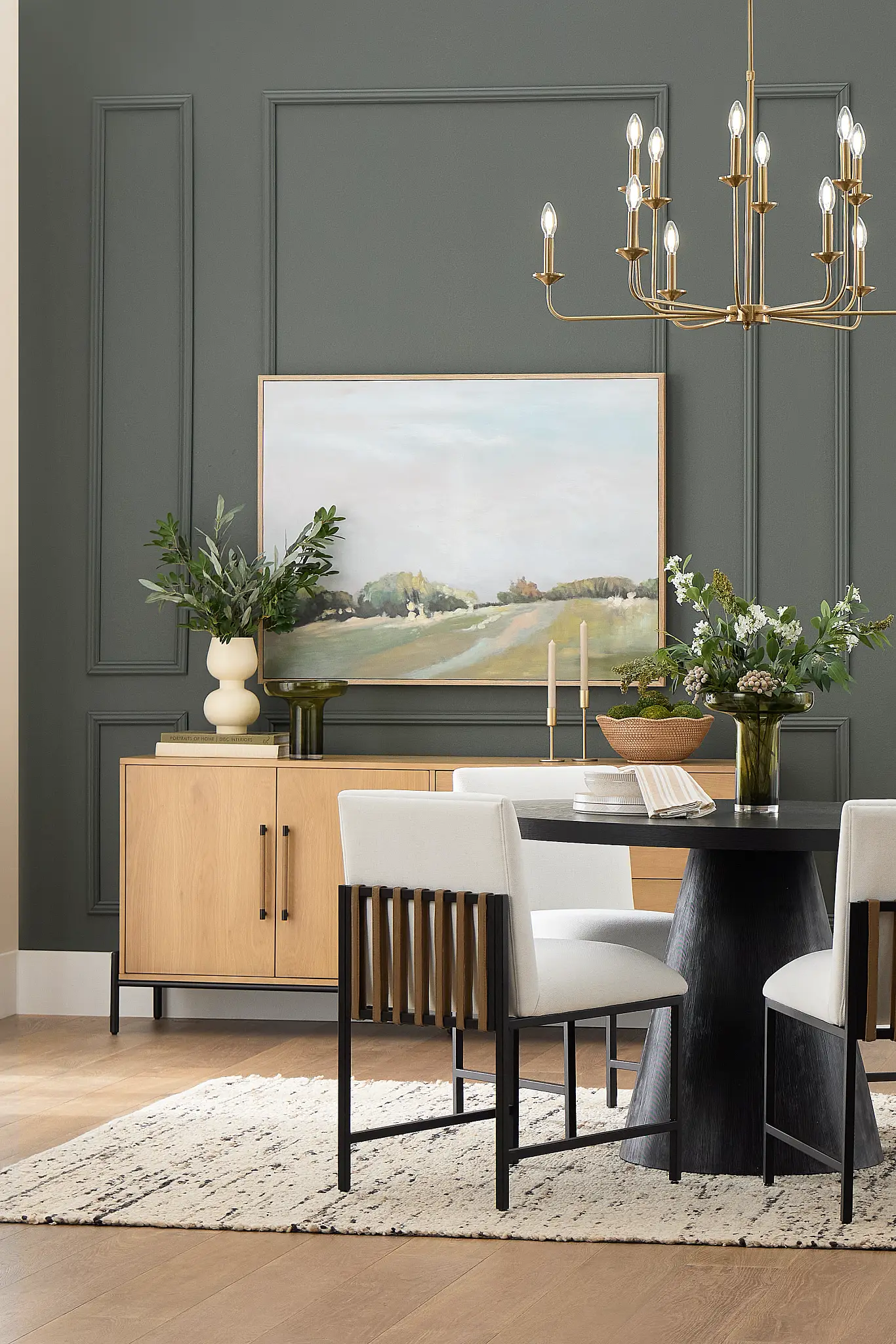
Bringing your Spring Color Story for 2026 to life has never been easier. With today’s smart design tools and services, you can confidently transform your space without the stress or guesswork.
A 3D room planner allows you to visualize your color choices, furniture placement, and textures before making any decisions. Seeing your spring palette applied in a realistic layout helps you experiment freely, avoid costly mistakes, and feel confident about the final result.
To make the process even smoother, fast shipping ensures your décor updates—whether it’s textiles, accessories, or furniture—arrive quickly, so you can enjoy your refreshed space right when the season begins. No long waits, no delayed inspiration.
And with free design services, expert guidance is always within reach. From selecting the right spring colors to styling each room cohesively, professional support helps you create a polished, well-balanced look that fits your home and lifestyle.
Together, these tools turn inspiration into action—making your spring refresh simple, seamless, and beautifully designed from start to finish.